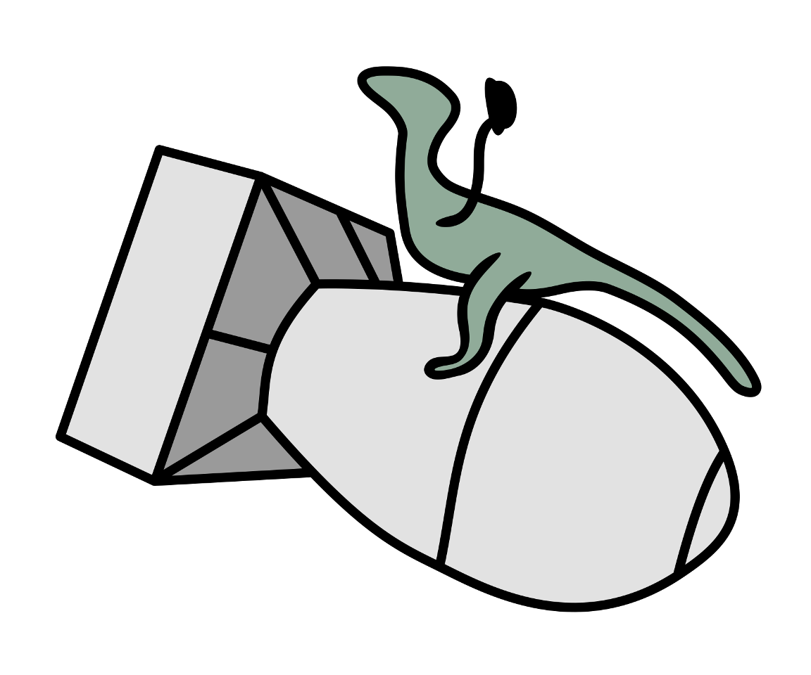
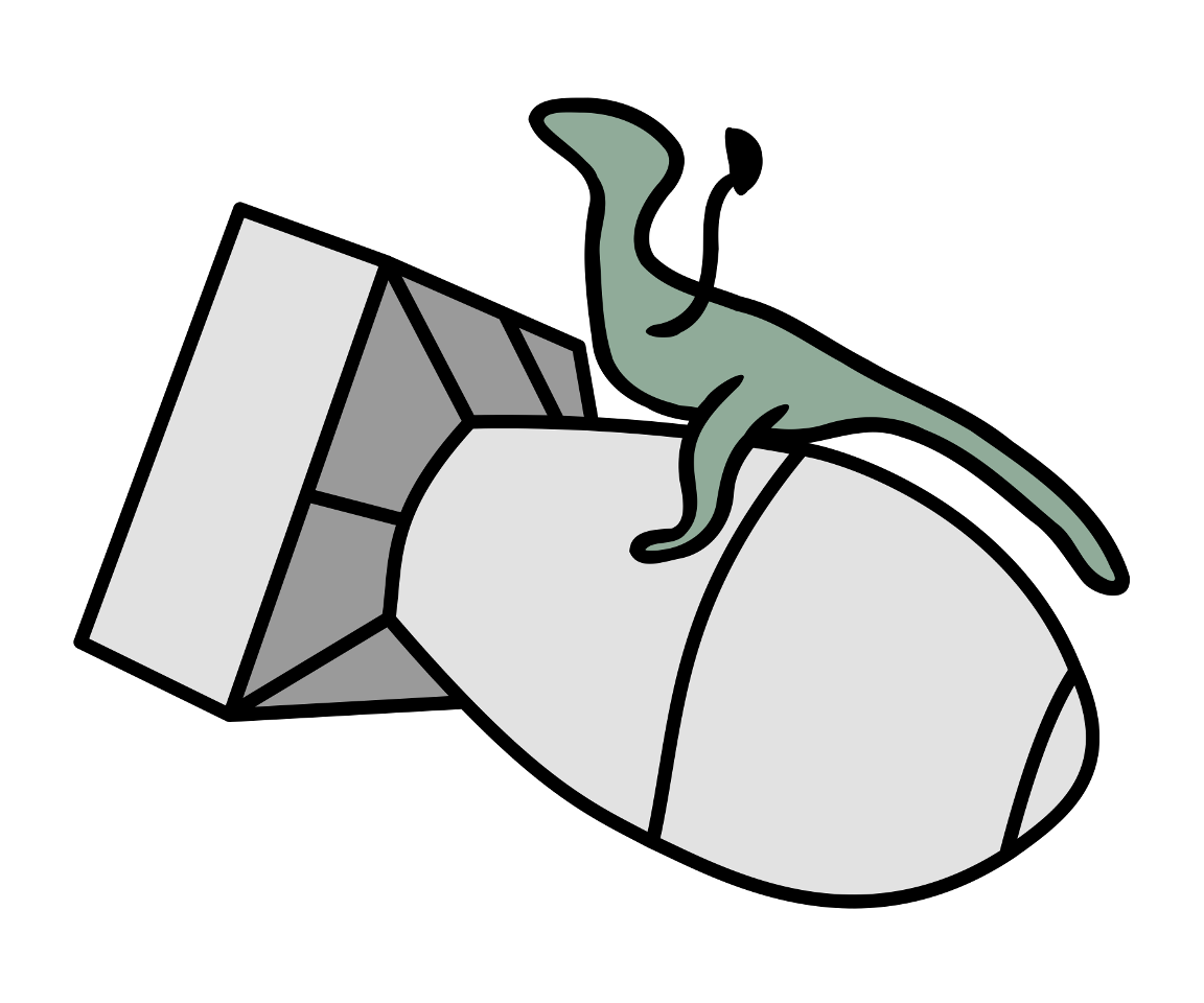
Velociraptor Aerospace Dynamics: Evolution of a nuclear dinosaur logo
 In 2011, I started Velociraptor Aerospace Dynamics.
The reasoning was practical: In 2010, I had made over $1,000 from Google ads, and once you hit $800 in miscellaneous net revenue, the IRS basically considers you a small business, whether you like it or not.
At that point, it makes sense to go the full route, forming an LLC (a perk of living in Nevada is cheap, easy LLCs), tracking expenses against revenue, etc.
The name was more whimsical than practical. Technically you’re not required to have a DBA (Doing Business As) name; I could have just become Ryan Finnie LLC. However, as most of my ad revenue came from the parody site velociraptors.info, I figured Velociraptor Aerospace Dynamics was topical yet sufficiently irreverent. The additional myth is I chose the name to try to get defense contracts based on the name. I am not allowed to divulge if that is true or not.
(Google ad revenue has since tanked. I recently finished my 2016 taxes, and noticed I had not even received a check from Google last year, as I did not reach the $100 minimum payout.)
While on a trip to Boston in April 2011, I created what would become the first VAD logo. I don’t consider myself an artist, but knew what I wanted it to look like: a raptor riding a falling nuclear bomb while waving a hat, ala Slim Pickens’s Major Kong in Dr. Strangelove. Using my ThinkPad’s TrackPoint to draw in Inkscape, I sketched it out.

Predictably, it wasn’t that great. A three-year-old with crayons could have done better.

A few weeks later, I found my old Wacom tablet and gave it another go, with much better success. I was able to clean up and simplify the raptor, and it ended up being almost exactly what I wanted. The bomb looked okay, but was still pretty rough, and my knowledge of Inkscape wasn’t good enough to clean it up sufficiently. When using the logo in media, I’d usually export it to PNG, bring it into Photoshop/Gimp and add color manually.

In 2014, I did a major revision of the logo. The bomb was completely recreated digitally; that is to say, one node at a time, and it looks much more clip-arty (which was the original intent). The raptor was tweaked slightly (I believe just filling in the small bit in the hat), and color was added directly to the SVG as fill layers. This is the version you all know and love.
But over the years, there were a few small issues I wanted to correct:
- While it’s not visible at lower resolutions, when zoomed in you notice many small jagged angles on the raptor. Vector graphics are supposed to be an infinitely scalable format so you don’t have “bitmapping”, but ironically this is the opposite of bitmapping. Basically, there are too many nodes on the raptor; too much detail.
- The raptor’s body outline width is uneven, and slightly thicker than the bomb’s outline overall.
- The rear fin of the bomb was created as a perfect rectangle, which isn’t right as the bomb itself is skewed toward the viewer a bit. The rear fin itself should also be skewed slightly.
- The raptor’s tail is kinked slightly at the end.
- The raptor’s head is perfectly flat right at the top.
- The hat is not hat-like enough. It’s supposed to be a bowler hat, but doesn’t always look like that. (In fact, at low enough resolution, it sort of looks like the raptor is flipping you off.)
All of these issues are very minor, and most are not even visible or noticeable in most media. But I knew.
A few months ago, I imported the logo (along with the previous two attempts for historical interest) into a Git repository. SVG is basically code, and changes are hence easy to track, so Git was a logical idea. And recently I spent a day and did a lot of work under the hood.

The raptor’s been completely redone. Before, the body outline was a two-dimensional path; now it’s a single curved line with a uniform thickness, equal to the bomb outline. (The legs and arm remain as paths as they need to be slightly variable.) The bomb’s rear fin has been skewed to better match the perspective of the bomb as a whole. All of the other concerns have been addressed, though in my opinion the hat is still not hat-like enough. However, there’s only so much you can do without scaling up the size of the hat, and it’s indisputable that a raptor waving a small hat is funnier than a raptor waving a large hat.
Overall I’m very happy with the work. Granted, most people would not notice the differences unless pointed out, and it’s not significant enough to, say, throw out my stockpile of stickers and order them again with the new design. But at Velociraptor Aerospace Dynamics, our logos deserve nothing but the best.
As long as it’s the best clip art of a cartoon dinosaur riding a bomb.
Additional fun facts:
- The bomb design is based on Fat Man, and its dimensions and perspective closely match the main photo on Wikipedia, though my version was completely freehand.
- The raptor herself was loosely based on Randall Munroe’s raptors in Xkcd. There’s even a tracing bitmap layer in one of my old SVGs, though the final product ended up being almost nothing like the Xkcd raptors.
- The VAD raptor does have a name. Her name is Ada, short for Adaptor. Adaptor the raptor.
- I cannot look at the VAD logo for more than about a minute before I start giggling.